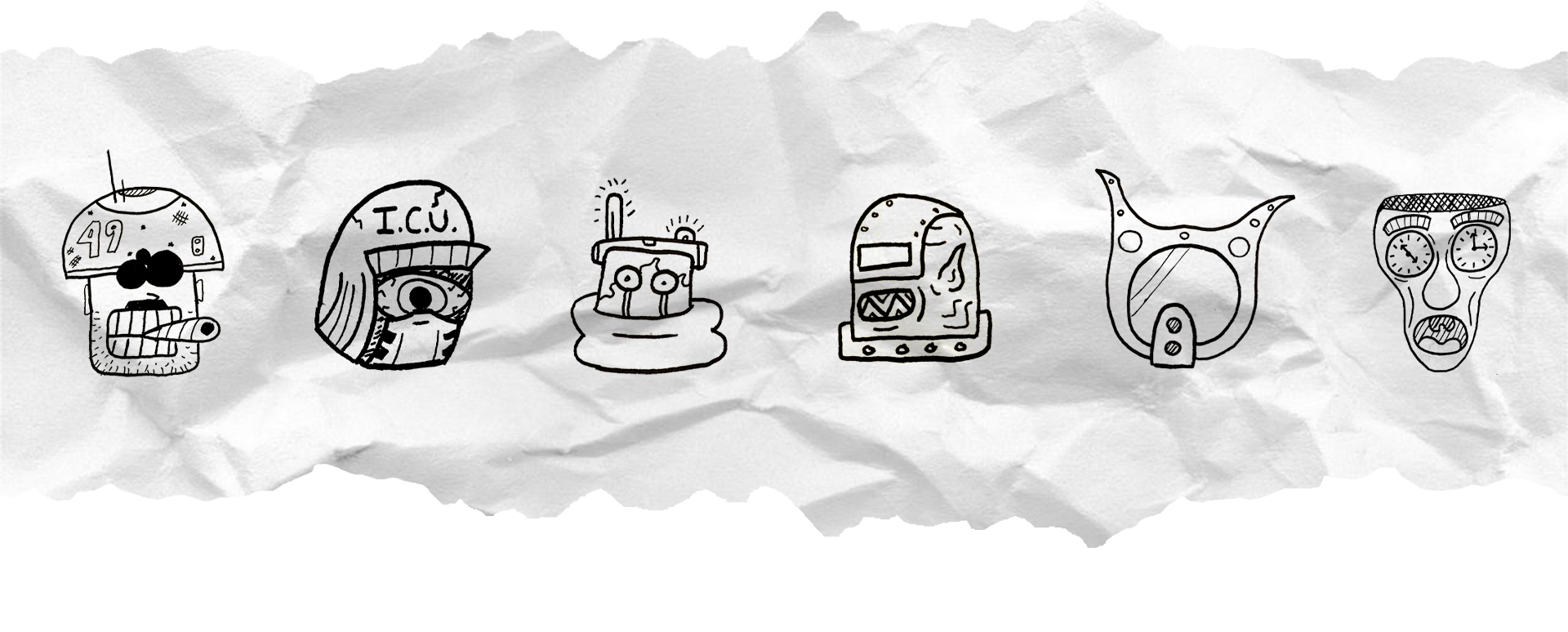
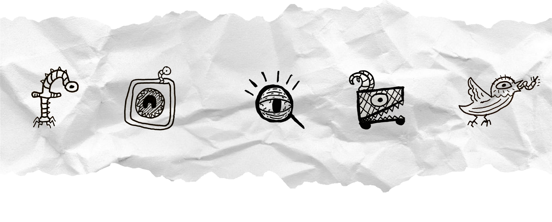
South Philly Bikes is, as the name implies, a bike store and repair shop in South Philadelphia. With over 25 years of experience, a light-hearted personality and a community driven mindset, it was important to me that this potential rebrand system encapsulated all three of these major elements. I was primarily inspired by cartoons and indie comics of the 90s and early 2000s when creating the characters and illustrations found throughout the system. In order to really lean into a sort of “notebook doodle” feel, every single aspect of this system was hand-drawn and scanned in for use.
In order to bring in the community driven aspect of the business to this system, I created a variable logo that incorporates public submissions for different iterations. While I created the “South Philly” lettering, the majority of the “Bike” variations were submitted by my peers at Drexel Westphal. In practice, the brand system itself could constantly grow and evolve through this same process
The variability and way in which this system is produced makes it simple and easy for designs to be applied to, or even created specifically for application to a wide range of merchandise and print mediums, such as books or in store signage.
The variability and way in which this system is produced makes it simple and easy for designs to be applied to, or even created specifically for application to a wide range of merchandise and print mediums, such as books or in store signage.


